Zoomak Tavern
Zoomak Tavern
information
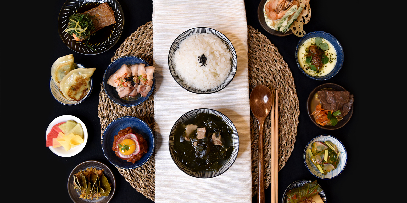
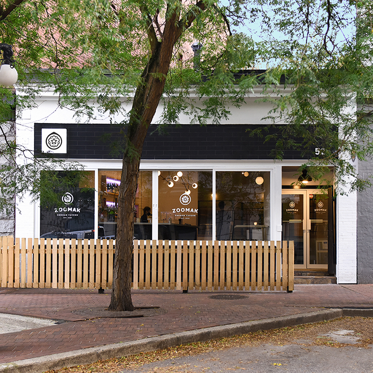
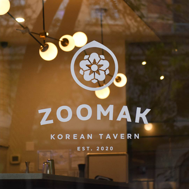
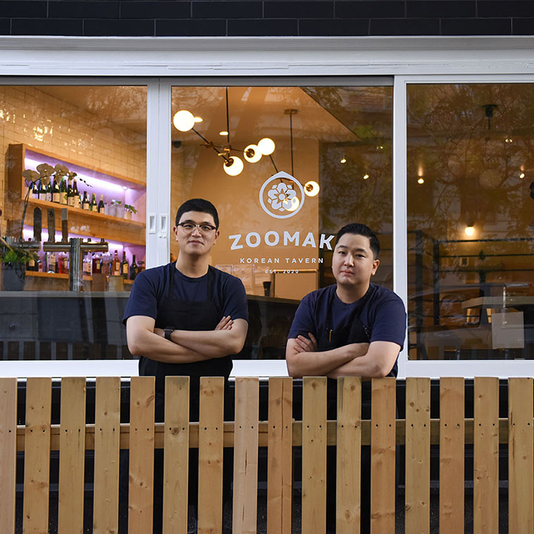
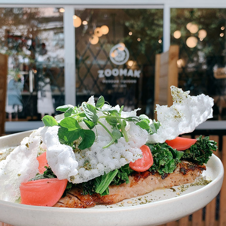
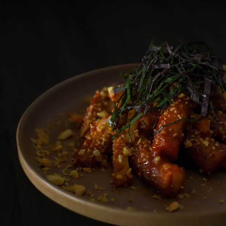
Zoomak is the Korean tavern that opened its doors in October 2020 in Vancouver. In old Korean society, a ‘Joomak’ was an old Korean tavern that served food with drinks to travellers. Team Zoomak wanted to do the same by showcasing a unique and authentic Korean dining experience but with a hint of a modern take on it. I translated that classic yet contemporary look and feel to the menu, website, social media, and other print materials.
objective
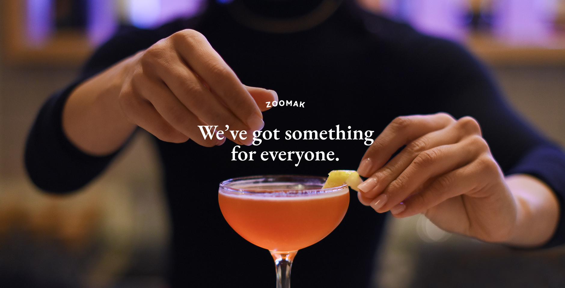
To build a memorable brand that reflects everywhere from the restaurant’s interior to its online presence and make sure it stays true to its mission and values.
deliverables
Brand Identity
Website
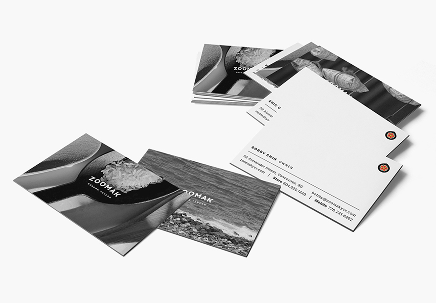
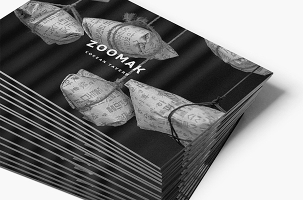
Print Collaterals
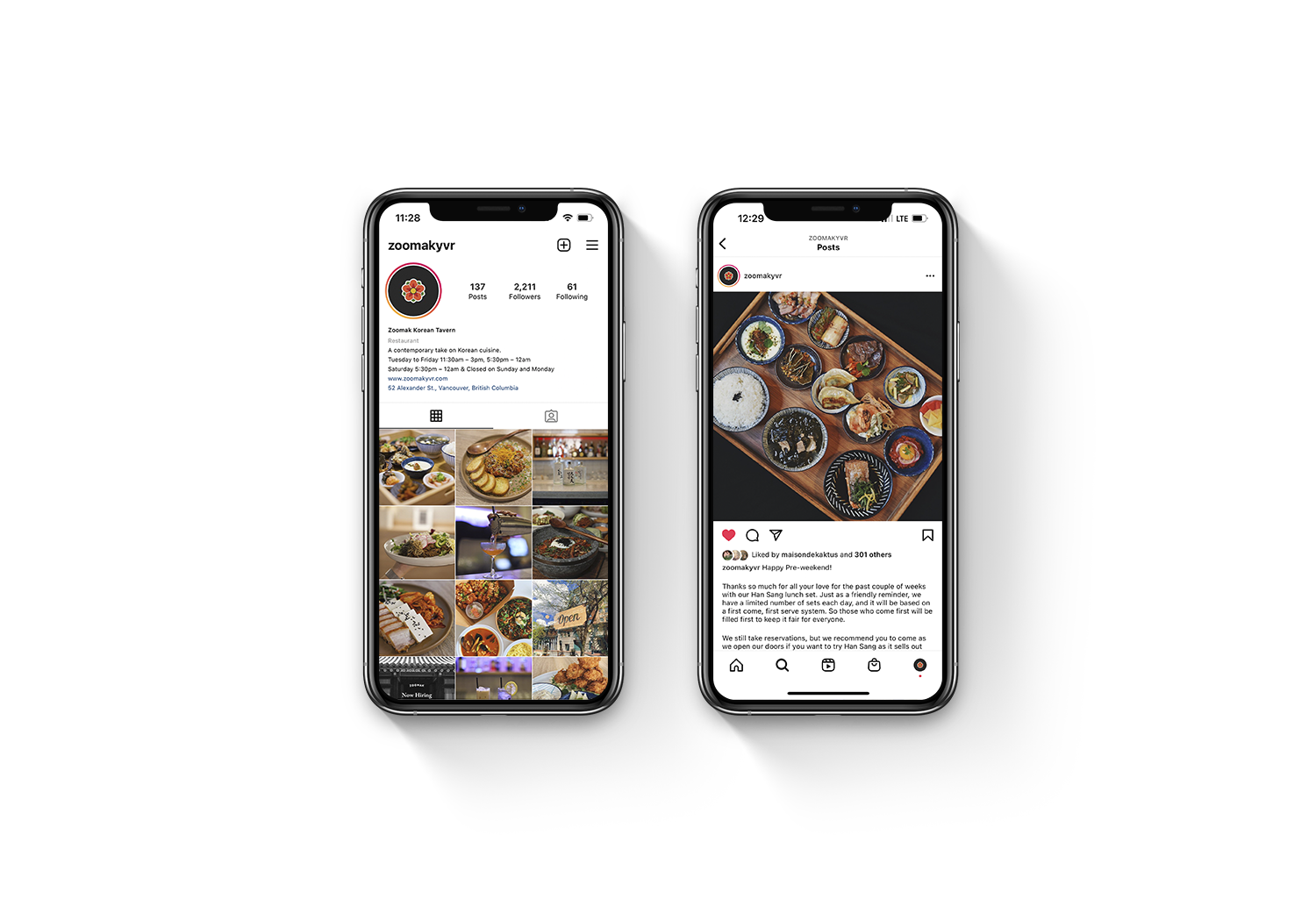
Social Media
looks and feels
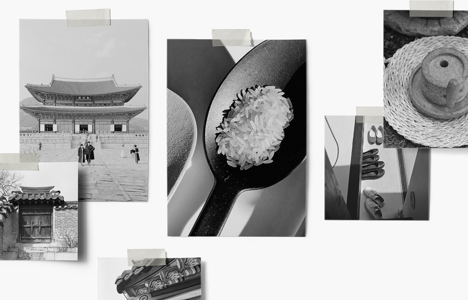
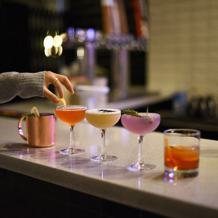
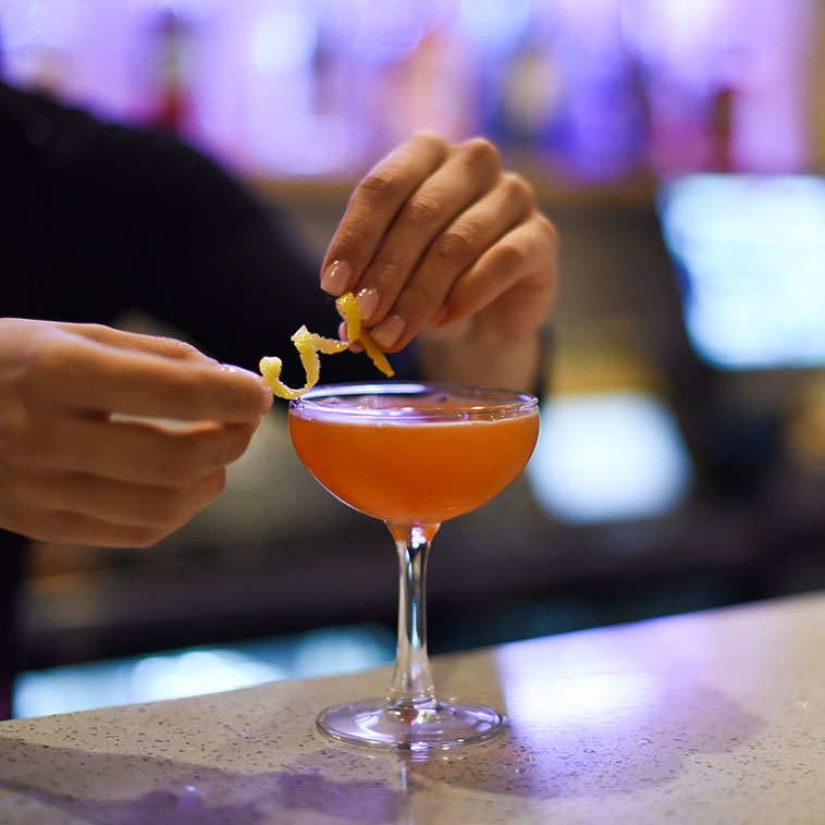
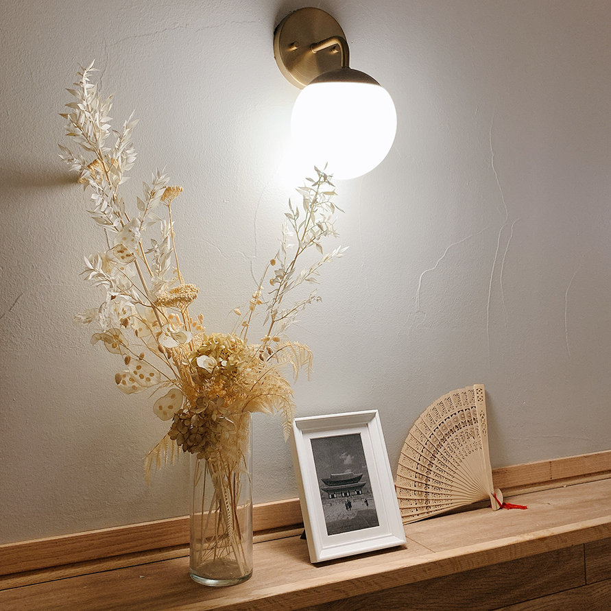
The images they had in mind were classic yet contemporary. I used classic typefaces in the Gothic & Garamond font family for the branding to stay authentic & traditional yet modern, then matched them with black and white pictures of Korea to make it classy. The authenticity but modernness reflects their food which has a contemporary twist to Korean food. For the logo, the colours and images are inspired by ‘Danchung (Korean traditional decorative colouring on wooden buildings)’ but instead swapped the flower to ‘Mugunghwa (The rose of Sharon),’ the national flower of Korea.